Investigating the Invisible: Analyzing Market Behavior and Divergence using an IDEC Autoencoder
Code available at Market Autoencoder Github
Background
Autoencoders have been part of neural network research since the late 1980s. In 1986, Rumelhart et al. introduced the idea of the ‘bottleneck network’ for principal component analysis, which forced the network to learn a compressed, distributed representation of the input data in order to reconstruct it.
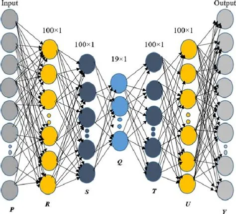
That simple idea laid the groundwork for Deep Embedded Clustering (DEC), a groundbreaking framework for simultaneous feature learning and cluster assignment. DEC had a critical flaw, though: it discarded the autoencoder’s decoder. This meant the optimization was driven only by the clustering objective. Given the reconstruction quality was no longer part of the loss function, the clusters could lose any intrinsic meaning in the context of the input data.
The Unseen Market
A few weeks ago I began to investigate the feasibility of applying this framework to equity returns. By using an autoencoder, I could theoretically extract market latent states, visualize these dimensions as well as correlate them to interpretable market regimes.
After I collected the raw OHLCV data for a basket of 16 equities since 2015, I calculated the per-day returns of each equity. Afterwards, I stacked the market returns of each equity at each day. Hence, the input data for this autoencoder would be the cross-sectional returns at each time-frame, fed in chronological order. In mathematical terms:
\[x_t = \begin{bmatrix} R_{\text{Asset 1}, t} \\ R_{\text{Asset 2}, t} \\ \vdots \\ R_{\text{Asset D}, t} \\ \end{bmatrix}\]This process ensures the autoencoder receives the concurrent returns of all assets, enabling it to learn temporal patterns.
Technical Stack
- Python: standard for quantitative finance and deep learning, allows for quick prototyping
- PyTorch: I found that it is easier to implement custom architectures in PyTorch rather than Tensorflow, although it takes slightly more boilerplate
- Numpy, Pandas, scikit-learn: standard for analyzing tabular data and statistical testing
- yfinance: due to being free and quite reliable, as well as flexible rate limits
Formulation of the Loss Function
In deep learning, the loss function is integral in the training of models. The loss function directly determines the magnitude and direction of the correction signal in the backpropagation step.
The loss function I implemented can be formally expressed as
\[\mathcal{L}_{\text{Total}} = \mathcal{L}_{\text{Recon}} + \lambda_C \mathcal{L}_{\text{Cluster}} + \lambda_D \mathcal{L}_{\text{Decorr}} + \lambda_V \mathcal{L}_{\text{Var}} + \lambda_{\text{Dead}} \mathcal{L}_{\text{Dead}}\]I will explain why each term is needed in order in the following sections.
Recon Loss
\[\mathcal{L}_{\text{Recon}} = \frac{1}{ND} \sum_{n=1}^{N} ||\mathbf{x}_n - \hat{\mathbf{x}}_n||_2^2\]Firstly, the recon loss is used to quantify the autoencoder’s error, from the input data to its reconstruction. The recon loss is the standard Mean Squared Error (MSE). Without recon loss, the autoencoder would have no incentive to learn to efficiently compress the cross-sectional returns.
In Pytorch, the simple MSELoss function can be used
recon_loss = nn.MSELoss(reduction="mean")(recon, x)
Cluster Loss
To implement clustering in the latent dimensions of this autoencoder, I looked no further than Improved Deep Embedded Clustering. IDEC was proposed to address the representation degradation issue in DEC. By retaining the reconstruction loss from the autoencoder and adding it back to the clustering, the coordinates of the cluster could still retain its meaning, and the learned latent space remains faithful to the original data structure.
I added a clustering loss that encourages the autoencoder’s latent space to form clear, well-separated groups. The model first estimates how strongly each embedded market state belongs to each cluster, then sharpens these estimates to focus on the most confident assignments. By training the model to match these refined assignments, the latent points are pulled toward their main cluster and pushed away from others, producing clean and meaningful clusters.
In code:
# STEP 1: Compute soft cluster assignments Q
# Each latent point is assigned to every cluster with a soft weight based on its distance to the cluster center (Student's t-distribution)
alpha = 1.0
# Measure how far each latent point is from each cluster centroid
dist_sq = torch.sum((z.unsqueeze(1) - centroids.unsqueeze(0)) ** 2, dim=2)
# Convert distances into soft similarity scores using Student's t-kernel
Q_num = (1.0 + dist_sq / alpha) ** (-(alpha + 1.0) / 2.0)
# Normalize across clusters so each row forms a probability distribution
Q_den = torch.sum(Q_num, dim=1, keepdim=True)
Q = Q_num / (Q_den + 1e-10)   # Q = soft cluster assignment

# STEP 2: Build the target distribution P
# This sharpens Q to emphasize confident cluster assignments and reduce the dominance of large clusters
# Estimate how frequently each cluster is used in the current batch
f_cluster = torch.sum(Q, dim=0, keepdim=True) + 1e-10
# Sharpen the assignments by squaring Q and reweighting by cluster frequency
P_num = (Q ** 2) / f_cluster
# Renormalize so each sample again forms a valid probability distribution
P_den = torch.sum(P_num, dim=1, keepdim=True) + 1e-10
P = P_num / P_den             # P = sharpened target distribution

# STEP 3: Optimize clustering by matching Q to P with KL divergence
# This pulls points toward their confident cluster centers and pushes them away from weaker assignments
# Detach P so it acts as a fixed training target (standard IDEC behavior)
P = P.detach()
# Minimize D_KL(P || Q) to shape the latent space into clean clusters
cluster_loss = nn.KLDivLoss(reduction="batchmean")(torch.log(Q + 1e-10), P)
Decorrelation Loss
z_centered = z - z.mean(dim=0)
cov_matrix = torch.mm(z_centered.T, z_centered) / z.size(0)
decorr_loss = torch.sum(torch.abs(cov_matrix)) - torch.sum(
    torch.abs(torch.diag(cov_matrix))
)
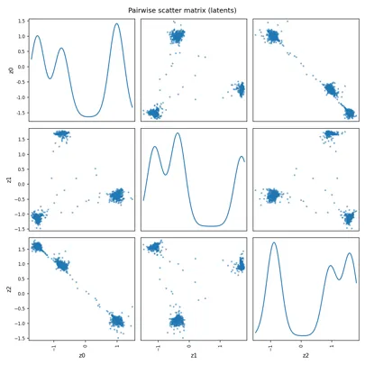
Although clustering encourages similar points to come together in the latent space, it can also cause different latent dimensions to become redundant or collapse into a single direction. By adding a small penalty for highly correlated latent dimensions, I encourage each dimension to carry distinct information. This prevents the latent space from degenerating into an effectively one-dimensional line and preserves a richer, more useful structure for clustering.
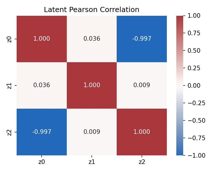
Due to this added term, correlation between latent dimensions fell dramatically, becoming a more reasonable number.
Variance Loss
\[\mathcal{L}_{\text{Var}} = \sum_{i=1}^{K} (\operatorname{Var}(\mathbf{z}_i) - 1)^2\]This term penalizes latent dimensions with overly small variance. It was added because after decorrelation, initial runs showed that some factors had near-zero variance, rendering them useless, even if they were uncorrelated. In practice, the term is the MSE between the dimension’s variance to 1.0. This pushes the variance of each latent dimension towards a target of 1.0.
In code:
variances = torch.var(z, dim=0)
var_penalty = torch.sum((variances - 1.0) ** 2)
Dead Dimension Loss
This term simply penalizes latent dimensions that are collapsing to constants. Even after the other penalties, the model often settled in local minima by only utilizing 2 of the latent dimensions and neglecting the other dimensions, reducing information that could be extracted later, as well as not allowing for the best reconstruction according to its hyperparameters. It is also worth noting that it consistently reached a lower reconstruction loss with the penalty added, due to it not getting stuck in the inferior state (0.4981 to 0.4781), although the difference was quite marginal.
stds = torch.sqrt(variances + 1e-8)
dead_penalty = torch.sum(torch.relu(0.1 - stds))
Training
I partitioned the dataset into a simple train, val, test split. More specifically, the training set was 2015–01–01 to 2023–12–31, and the data from that date to 2024–06–30 was for validation. The rest of the data was reserved for out-of-sample testing. That being said, using a larger dataset for a longer time frame would most likely lead to better performance, but for this project this dataset provided sufficient temporal coverage.
To prevent data leakage, I normalized each asset’s returns using a rolling z-score computed over the previous 60 days, with the statistics shifted by one timestep to prevent look-ahead bias. For validation and test data, the initial rolling statistics are seeded using the final training window, and all values are clipped to ±10 to control extreme outliers under distribution shift.
self.rolling_means = {}
self.rolling_stds = {}
for col in df.columns:
    self.rolling_means[col] = (
        df[col]
        .shift(1)
        .rolling(window=rolling_window, min_periods=1)
        .mean()
    )
    self.rolling_stds[col] = (
        df[col].shift(1).rolling(window=rolling_window, min_periods=1).std()
    )
self.train_stats = {
    "means": pd.DataFrame(self.rolling_means),
    "stds": pd.DataFrame(self.rolling_stds),
}
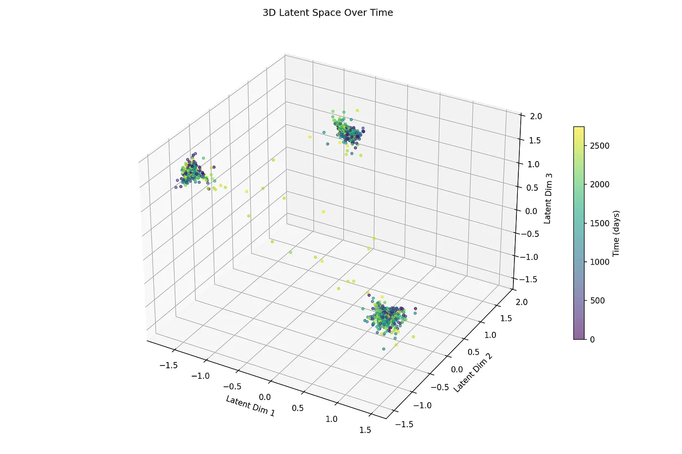
All in all, the autoencoder learnt some meaningful market structure and managed to cluster its latent states, which can be seen from this t-SNE graph. For context, t-SNE is a nonlinear dimensionality-reduction algorithm that projects high-dimensional data into 2D or 3D while preserving local neighborhood structure for visualization.
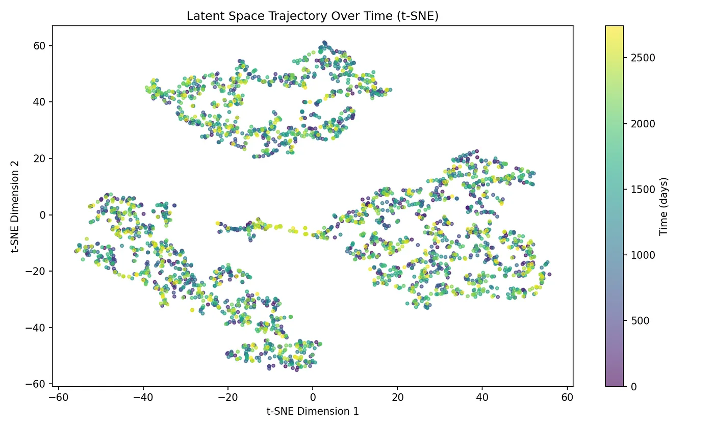
As you can see, there are very 3 clearly distinct clusters in the latent dimensions of the autoencoder, which I will try to analyze and make sense of later.
Results
1. Anomaly Detection: Utilizing the Autoencoder Reconstruction Ratio (ARR)
Although this was not my main objective, I wanted to test my hypothesis that periods where markets diverge from learnt structure would cause a higher reconstruction loss.
After training, on the test dataset, I fed the returns of SPY (which I purposely left out of the train/val dataset), stacked in the shape of the data input from training.
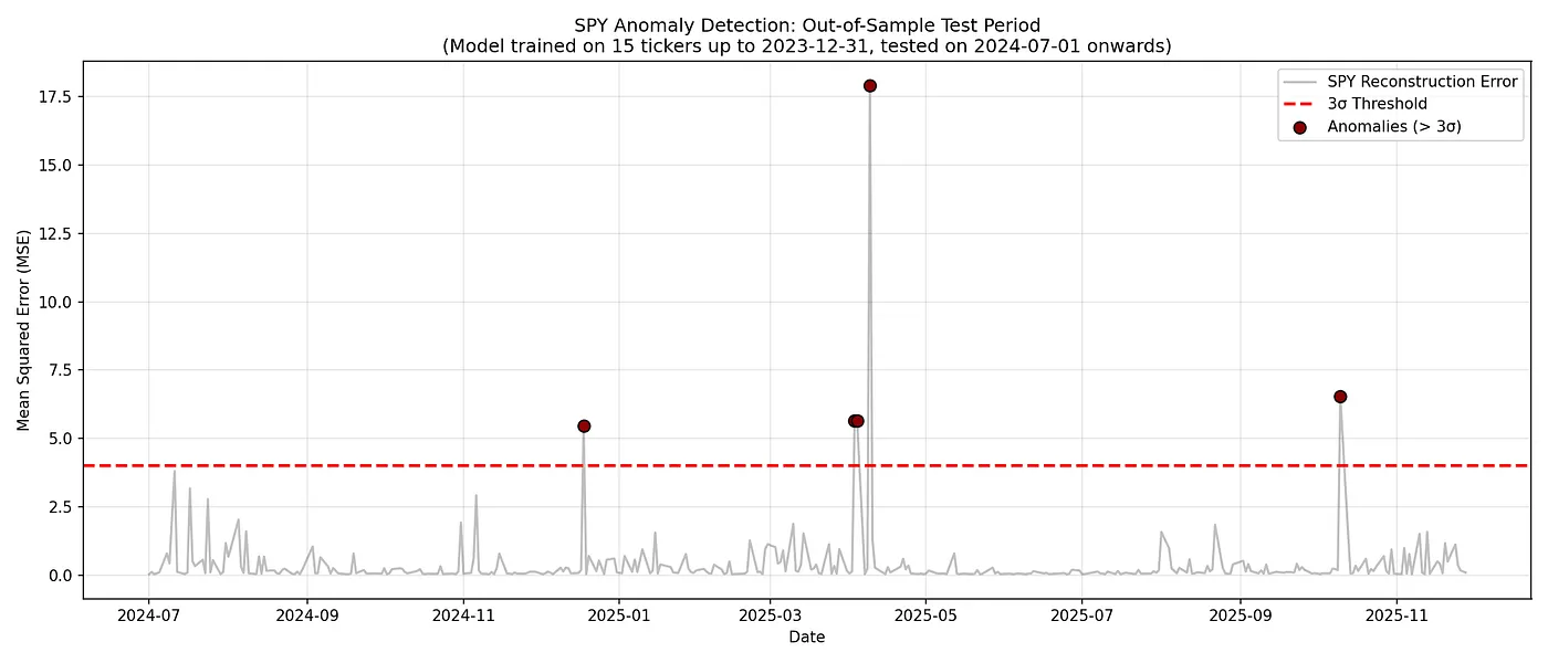
Surprisingly, the autoencoder did have a higher reconstruction loss during periods of erratic market behavior. Notably, in April 2025, it flagged three days in short succession as anomalous, that is April 3, 2025, April 4, 2025, and April 9, 2025. Early April 2025 marked a major crash in U.S. equity markets triggered by sweeping new tariffs announced by Donald Trump, dubbed “Liberation Day”, that imposed significant import duties. That sparked broad fear, selling, and a steep drop across stocks. This autoencoder reconstruction loss indicator should not be used on its own, although high reconstruction losses could serve as potent reminder that the current market behavior is unlike anything in the past.
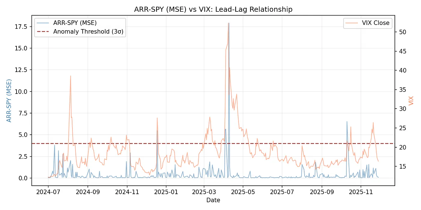
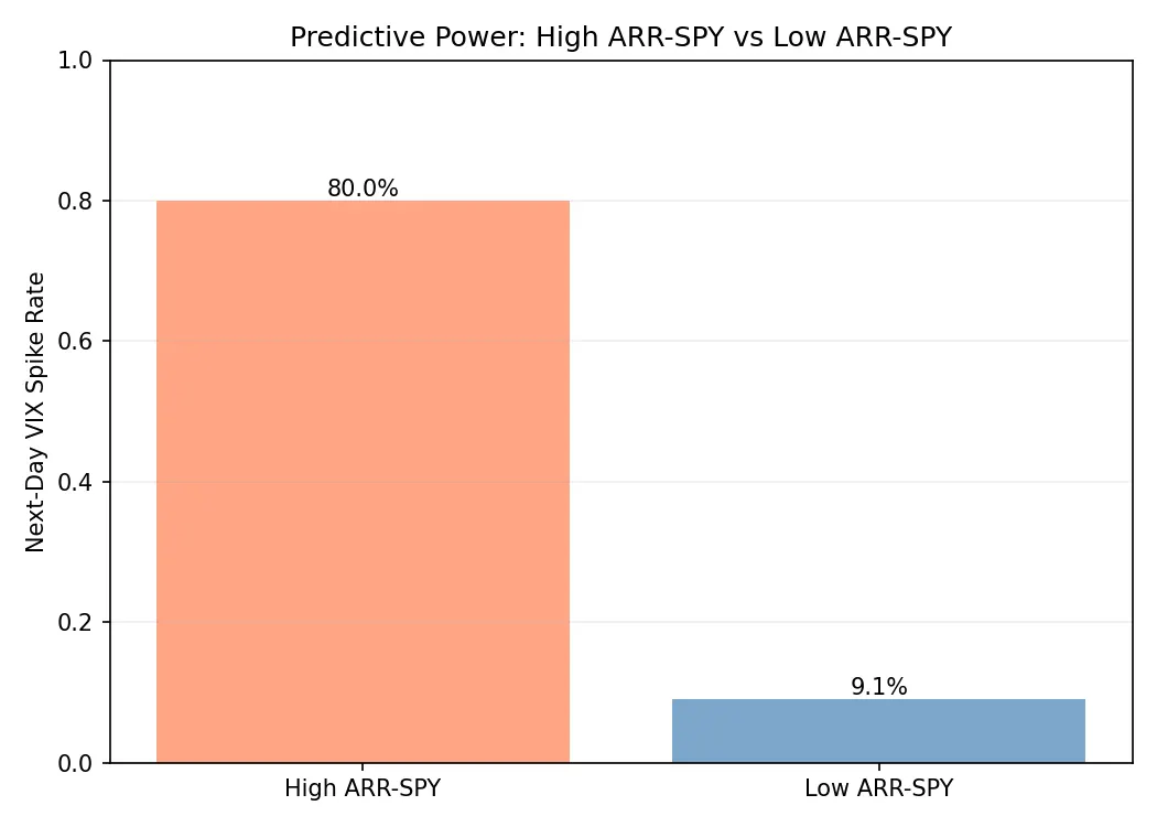
I graphed the relationship that ARR had with VIX spikes (based on the market’s 30-day expected volatility of the S&P 500 derived from real options prices) in the testing dataset. The graphs above serve as visual heuristics that indicate that the high reconstruction losses may help serve to forecast next day VIX spikes. However, further testing is needed before definitively arriving to that conclusion.
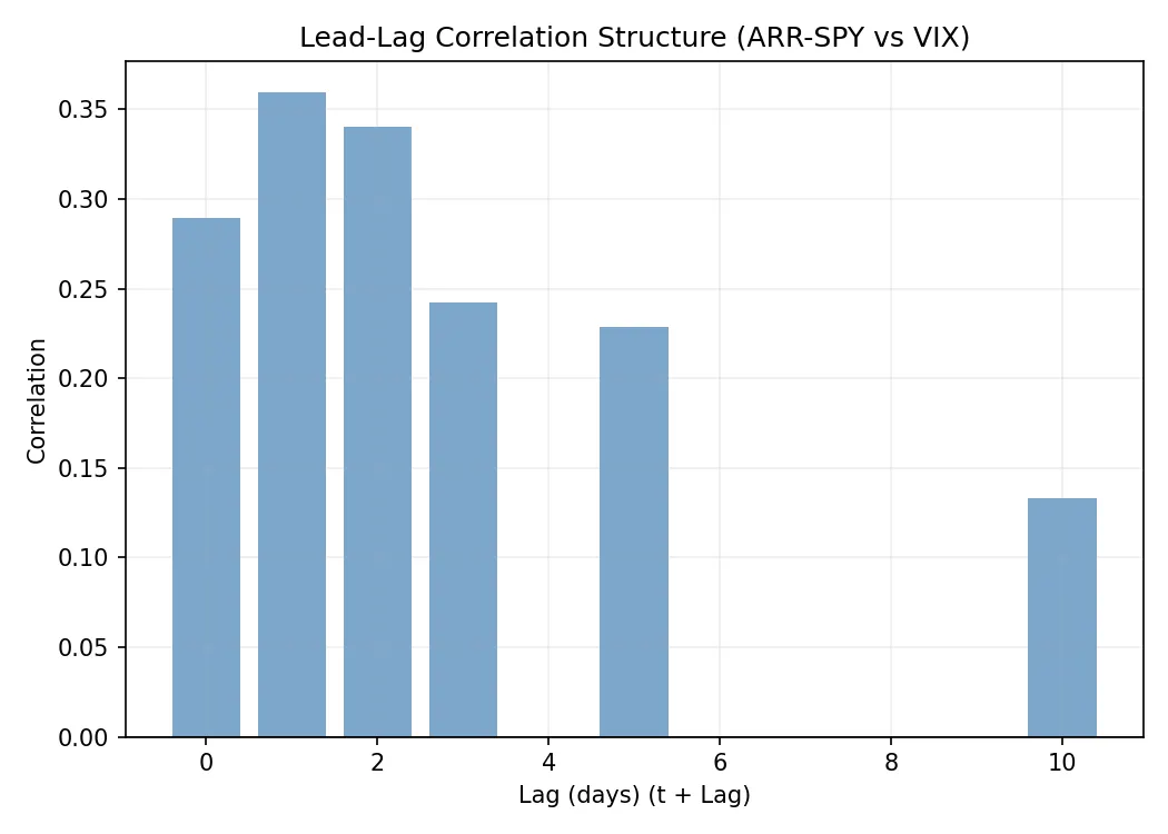
To examine deeper, I graphed the correlation of high ARR on SPY with high VIX prices, across several time frames. Under closer inspection, this graph indicates that the ARR of SPY does indeed have short term forecasting ability, but this requires further testing to prove that this correlation is statistically defensible.
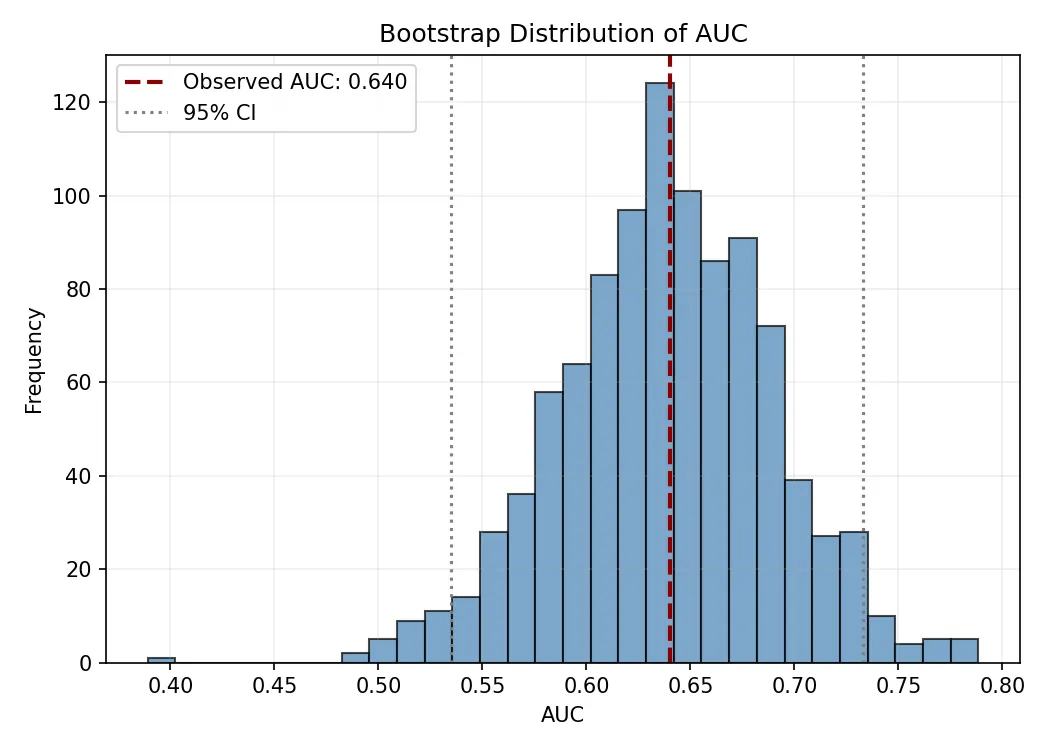
The bootstrap AUC histogram shows the distribution of model performance under repeated resampling of the test data, giving a direct estimate of statistical uncertainty around the observed AUC of 0.640. The red dashed line marks the original test AUC, while the grey dotted lines show the 95% confidence interval.
Because this interval lies well above 0.5, the model is very likely capturing real predictive signal rather than randomness, though it remains below the level typical of strong classifiers (>0.8). The tight concentration around 0.64 indicates that performance is stable and not driven by a lucky data split, while the overall spread reflects noise and non-stationarity in financial markets. Overall, the results suggest moderate but genuine predictive power with meaningful statistical uncertainty.
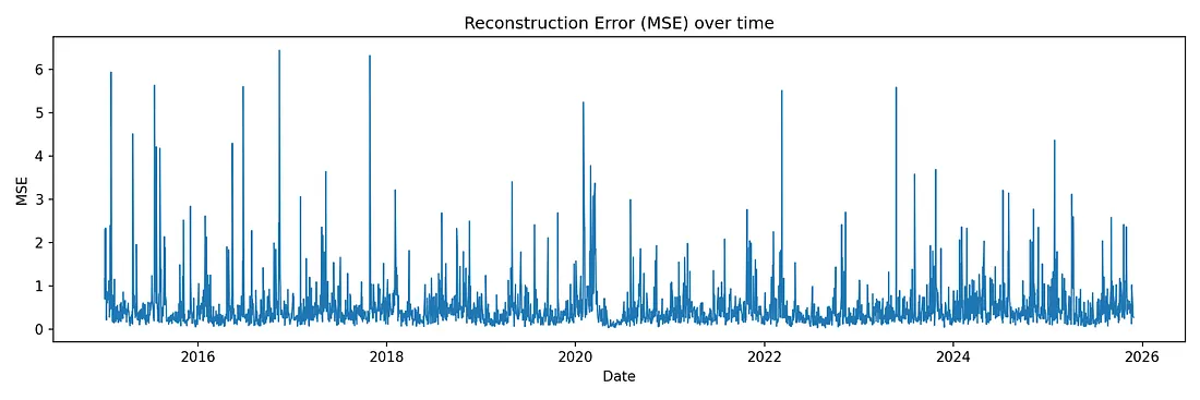
Lastly, I examined the reconstruction error over the entire SPY dataset (even the training and validation datasets), less for rigorous testing but more for understanding the overall trend. There is a clear period with a higher baseline reconstruction error from early 2020, coinciding with the COVID-19 pandemic that caused unusual market activity.
2. Analyzing Clustering: Investigating the Autoencoder’s Latent Dimensions
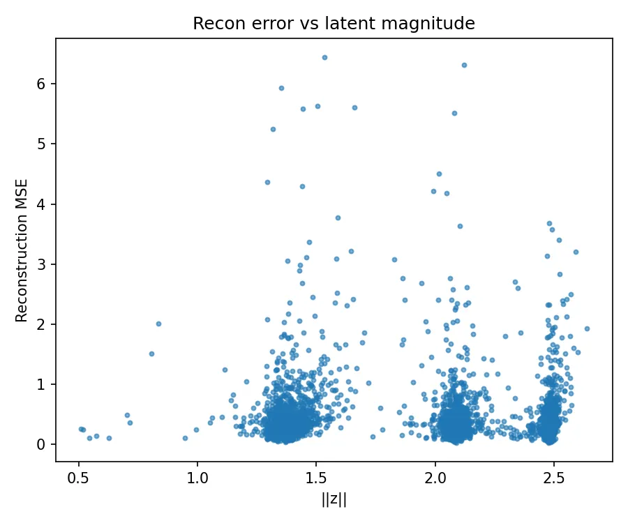
To start analyzing the latent dimensions, I attempted to see if there was any meaningful correlation between the reconstruction MSE (which I previously suggested could signal market anomalies) with the magnitude of the latents. However, from the graph it is clear there is no clear magnitude that is favored for higher MSEs.
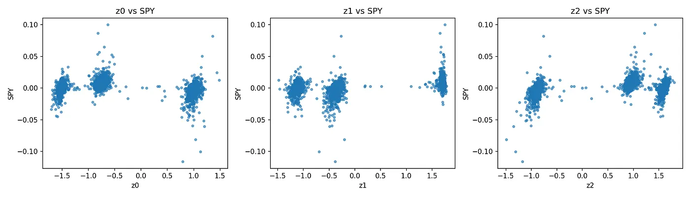
For good measure, I also graphed a scatter plot of each latent dimension to SPY returns, to see if any clusters tended to be chosen for periods of higher returns. From the graphs it is clear that there is no significant correlation, as the returns for all three are around 0. I tried to explore if there was a pattern between the raw coordinates to forecasting (by Lasso regression), but unfortunately there was only negligible correlation.
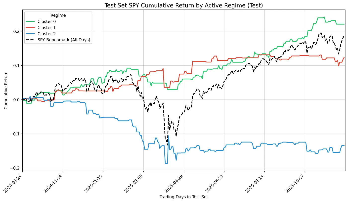
I separated the test period into three lines, one tracking days assigned to each cluster. The separations look striking: green climbs to +23%, red holds at +12%, blue bleeds to -14%.
The model assigns each day to a cluster based on that day’s cross-sectional returns: which stocks moved, how they moved relative to each other, the specific pattern of the session. However, by the time I have that information, the market has closed. I know I was in Cluster 0 or Cluster 2, but I don’t know what tomorrow will be.
Furthermore, the clusters aren’t stable enough to persist, so today’s assignment offers little information about tomorrow’s.
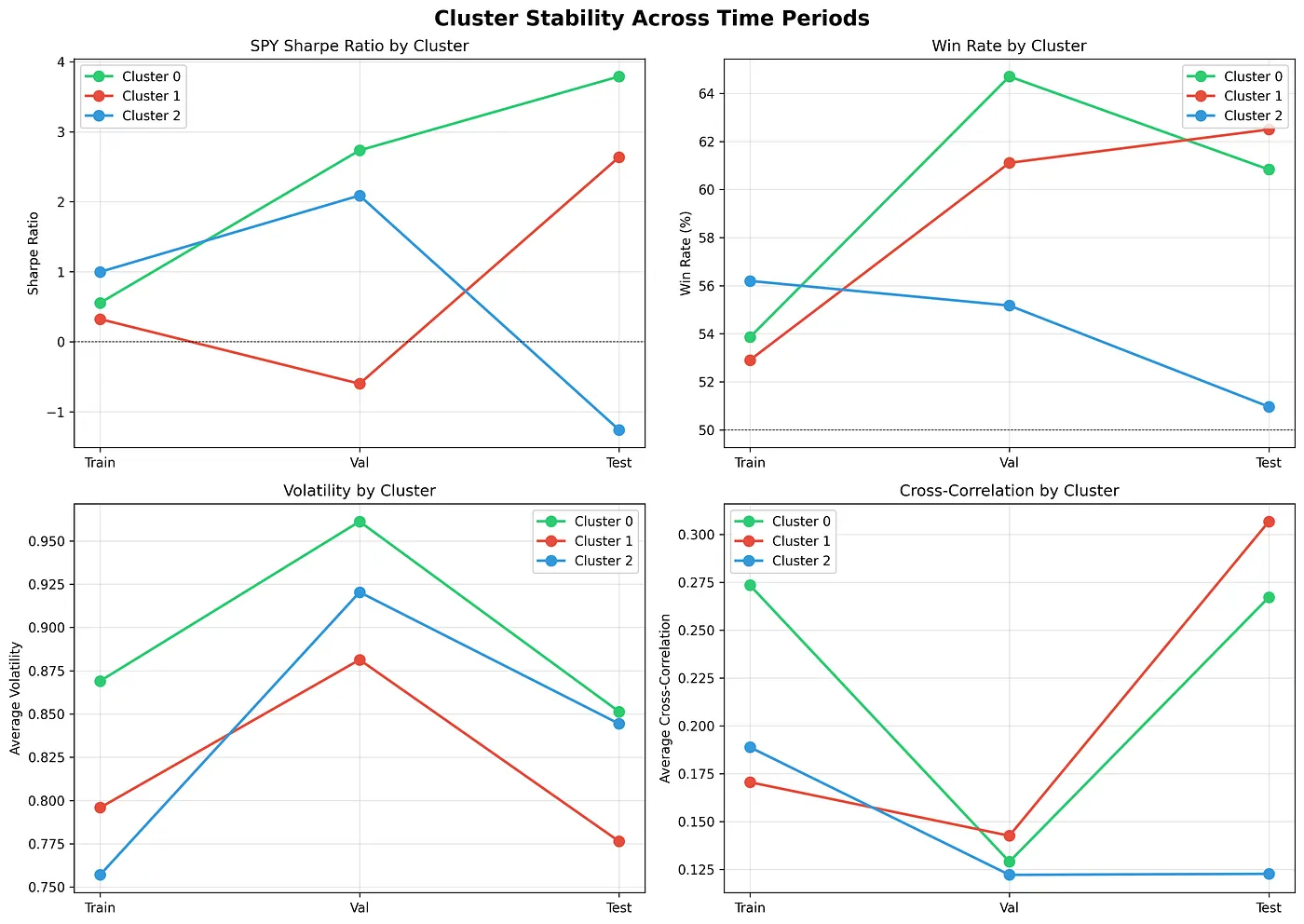
However, it is clear that this analysis of latent dimensions does not have significant forecasting ability. Look at the Sharpe ratio graph: Cluster 0 goes from 0.5 in training to 3.79 in testing. Cluster 1 swings from 0.3 to 2.64. Cluster 2 plummets from 1.0 to -1.26. These aren’t stable predictive patterns. They’re regime-dependent statistics that shift out-of-sample. The characteristics remain (look at the volatility and cross-correlation staying relatively stable), but the performance doesn’t translate.
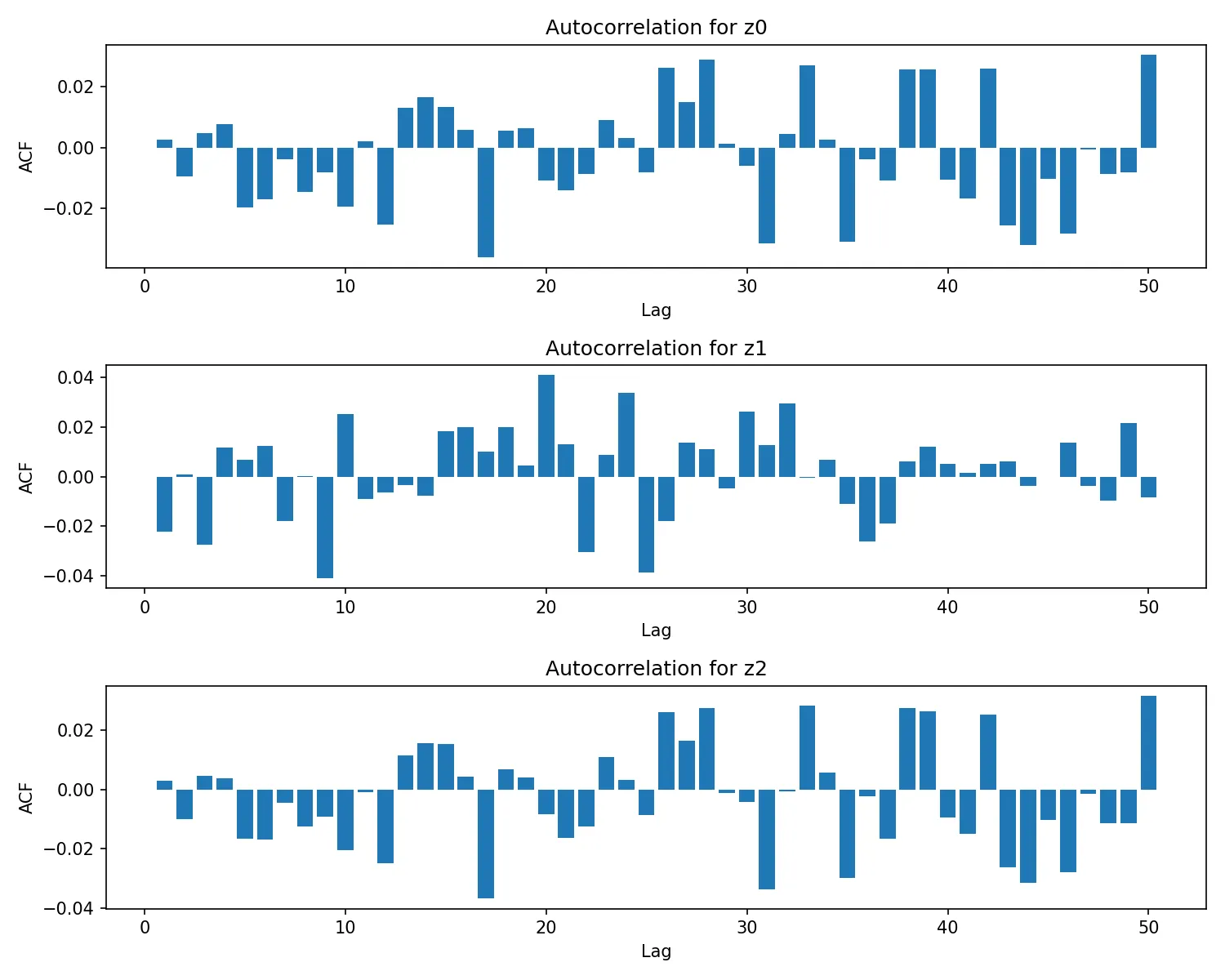
The autocorrelation plots for z0, z1, and z2 (for the 3 latent dimensions) show values tightly clustered around zero across lags 1–50, with only small, scattered spikes (generally within about ±0.04) and no clear decay pattern or periodic structure. This indicates that the latent variables exhibit weak temporal dependence, meaning their current values are largely independent of their past values.
To visualize what defines each regime, I constructed a heatmap showing the average daily return of each stock during the days each cluster was active. For each of the three clusters, I filtered the test period to only the days assigned to that cluster, then calculated the mean return for every stock across those session.
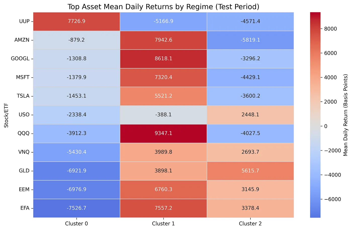
The heatmap displays only the top-performing stocks from each regime (the ones that appeared in at least one cluster’s top 5) and sorts them by their performance in Cluster 0. Returns are shown in basis points (hundredths of a percent) to make the magnitudes clearer. Each cell answers a simple question: “On days when this cluster was active, how did this stock typically perform?” The resulting patterns reveal the cross-sectional structure that defines each regime: not just whether the market went up or down, but which assets led and which lagged.
Cluster 0:
  Stability (Stock Overlap): 4/5 matches (AMZN, UUP, GOOGL, TSLA)
  Top 5 Defining Stocks: UUP, AMZN, GOOGL, MSFT, TSLA
  Test Set Frequency: 40.5%
  Test Set SPY Sharpe: 3.79
  Sharpe Change (Test - Train): 3.23
Cluster 1:
  Stability (Stock Overlap): 3/5 matches (AMZN, QQQ, MSFT)
  Top 5 Defining Stocks: QQQ, GOOGL, AMZN, EFA, MSFT
  Test Set Frequency: 24.3%
  Test Set SPY Sharpe: 2.64
  Sharpe Change (Test - Train): 2.31
Cluster 2:
  Stability (Stock Overlap): 5/5 matches (USO, GLD, VNQ, EEM, EFA)
  Top 5 Defining Stocks: GLD, EFA, EEM, VNQ, USO
  Test Set Frequency: 35.1%
  Test Set SPY Sharpe: -1.26
  Sharpe Change (Test - Train): -2.25
Yet, the structure itself is undeniable. In short, each cluster can be characterized as dollar strength, tech euphoria, or commodity rotation.
Cluster 2 is the most stable. Its defining structure (gold, international equities, real estate, and commodities leading while tech lags) matched perfectly across training and test. All five defining assets held, confirming this was not noise but a persistent risk-off regime that lasted over a year out-of-sample. While timing kills predictive alpha, the regime structure itself generalizes.
The heatmap makes this explicit. When the market enters Cluster 2, the cross-sectional return structure flips: UUP and QQQ falls, tech bleeds, and commodities rise. This coherent rotation appears ~35% of the time and reflects a true defensive capital shift. The autoencoder learned the fingerprint of risk-off environments.
Clusters 0 and 1 show similar structural stability (4/5 and 3/5 asset matches), each capturing distinct risk-on variants. One was driven by dollar strength despite weaker tech, while the other by pure growth leadership. Their Sharpe ratios surged in 2024–2025 not due to model luck, but because the macro regime strongly favored these states. The structures stayed fixed; only the payoff changed with the macro wind.
Conclusion
My autoencoder found exactly what I asked it to find: structure. Out of the noise emerged three stable regimes, dollar strength, tech euphoria, and commodity rotation, each interpretable, each persistent across unseen data. When gold and international equities led while tech lagged, the model recognized it immediately. When the market fractured during COVID or Liberation Day, the reconstruction loss spiked. These weren’t visual illusions. The patterns were real.
What it did not become was an oracle. The clusters themselves could describe the present with uncanny precision, but when traded forward in isolation, their clarity softened. Markets don’t reward observation alone but anticipation. In that sense, the regime clusters were not forecasting engines. They were measurement instruments to make sense of the current state of the stock market rather than to forecast what state would tomorrow be.
Still, not all signal vanished at the boundary of prediction. The out-of-sample ARR on SPY behaved differently. When it spiked, it did not promise direction, but it did warn of instability. Used alone, it is not a trading system. However, used alongside volatility, positioning, and risk constraints, it becomes a potent conditional signal, one that says “I’ve never seen the market behave like this”.
Future Considerations
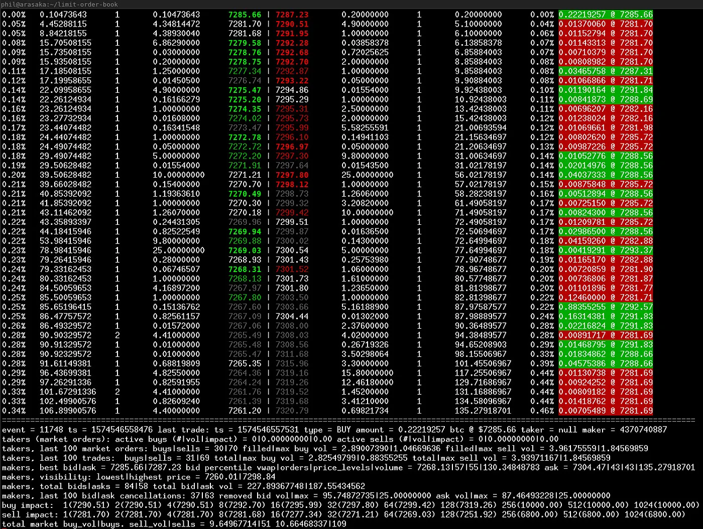
In the future, using high frequency LOB data could likely yield better results as there is still market microstructure that has not been arbitraged away yet, likely due to the exclusivity of the data as well as the infrastructure needed to trade at the speeds necessary. That being said making a deep learning model that can analyze fast enough to trade at that time frame could prove a challenge in itself. In fact I intended to use LOB data but I could not get enough to train a robust model, so I pivoted to daily OHLCV which was easier to obtain.
Furthermore, I would experiment with replacing the standard dense layers in the Encoder/Decoder with LSTMs or GRUs. This would allow the model to learn how the transition from Regime A to Regime B impacts the latent space, potentially making the latent states less “memoryless”, as suggested by my autocorrelation analysis. Having a more diverse dataset as well as using a grid-search to obtain the best hyperparameters could likely yield better results, and I will think about implementing these features in the future.
Getting the Code
I’ve uploaded all the code to Github, so you can replicate these findings: Market Autoencoder. All of the code has been released as well as the graphs generated by the scripts.
If you found this interesting, it may be worth reading my previous project where I implemented a hybrid GARCH-LSTM. All of the code for that project is open source as well.
Closing
At its core, the market remains a contest of information. Once human-designed features are exhausted, the remaining edge lies in extracting patterns too high-dimensional for intuition. Autoencoders don’t invent prophecy, but they do expand perception. They scan raw returns from angles no trader or hand-built model could ever fully explore.
Einstein didn’t change reality when he introduced General Relativity, but he changed the lens through which reality is seen. These architectures do the same for markets. And in a game defined by information, a broader lens is still an advantage.